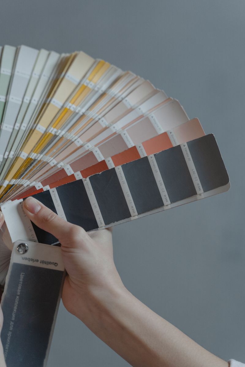
Undertones are everything
Every neutral has an undertone — a gray can lean blue, green, or purple; a white can lean warm (yellow) or cool (blue). The undertone is what makes a color feel 'off' next to your floors, cabinets, or trim. Compare samples side by side and against your fixed finishes to spot them.
Test in your actual light
Paint large samples (at least 2x2 feet) on more than one wall and look at them morning, noon, and night. North-facing rooms read cooler; south-facing rooms warmer; artificial light shifts color too. A chip in the store tells you almost nothing about how a color lives in your room.
Pro tip: Use peel-and-stick samples or paint poster board you can move around the room and against trim and floors.
Build a simple palette
- Pick one main wall color, one trim color, and one accent.
- Keep sheen consistent within a category (all trim semi-gloss, etc.).
- Let fixed elements — flooring, stone, cabinets — lead the palette.
- When in doubt, go a shade lighter; color reads more intense on a whole wall.
Whole-home flow
For open floor plans, choose colors that share an undertone so rooms transition smoothly. A common approach is one wall color throughout the main spaces with varied accents, or stepping a single color up and down in value room to room.
Frequently asked
Scale and light. Color intensifies across a whole wall and shifts with your room's natural and artificial light — always sample large and in place.
Often, but match the white's warmth to your walls. A cool white next to warm walls can look stark; a soft white blends better.
A cohesive home usually uses a small palette — a main neutral, a trim color, and one or two accents — repeated throughout.